Website Design
Working through Squarespace, I was able to fully design my website which includes, e-commerce, newsletter, and blog. This website is the primary source of showcasing my artwork, purchasing from my inventory, commissioning one of kind pieces, and connecting with me. It is imperative to make my site easy to navigate, and friendly to new customers. Creating a blog has created trust with my audience to not sell artwork but create a lifestyle with my brand.
For over two years now, I have been helping others design or revamp their Squarespace websites. I have helped TaskCause create a user friendly and modern website. Along with creating Squarespace sites for HGB Group insurance clients, Wanda Scott and Associates, and Taraxa.


Branding
I have created logos, stationary, and business cards for companies such as SmartWaste, Gem Finder, and Wanda Scott and Associates. I believe in creating an elevated modern brand that is able to scale. Here are some examples.


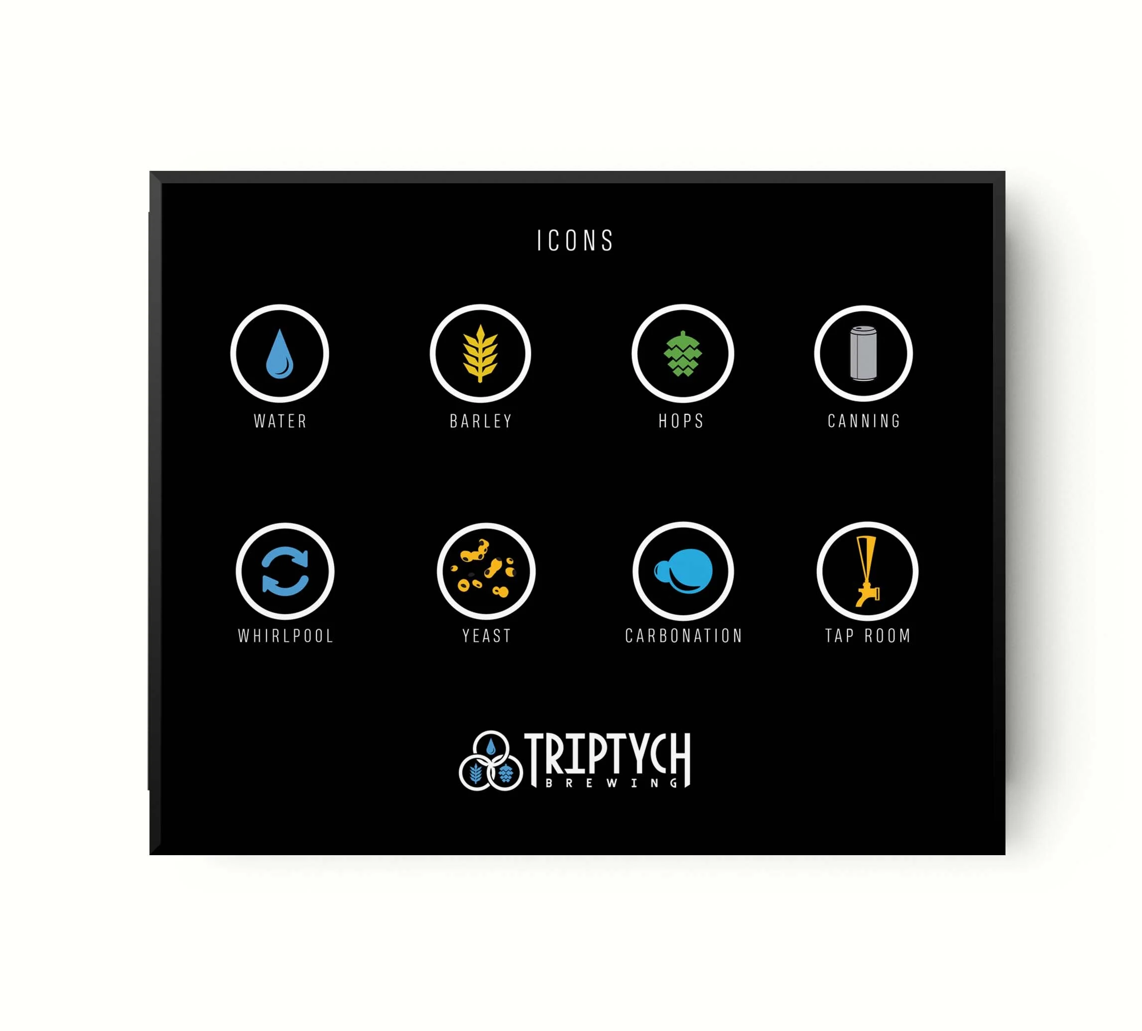
Mural Illustration Design
The mural for Triptych Brewing was a chance to expand on their brand. I created 8 icons based off their logo and incorporated them into my illustration. These icons provided information on each step in the brewing process. The bold graphic chalkboard illustration style matches Triptych’s creative experimental brewing flavors.
The mural for Hammerhead Coffee showcases the brand’s pledge to handcrafted coffee. I created illustrations of the coffee tools and ingredients that displayed their process. The illustration is companied by Hammerhead’s mission statement and history of its origin.


Illustration
I have created many infographics for various clients. I have created the branding and marketing materials for In Good Taste. These infographics are used for social media, blogs, newsletters, and more. The top rows are a few examples.
I have also created, illustrated, and rebranded Taraxa infographics. I created new and relatable characters, graphics, and icons. Here are a few examples.


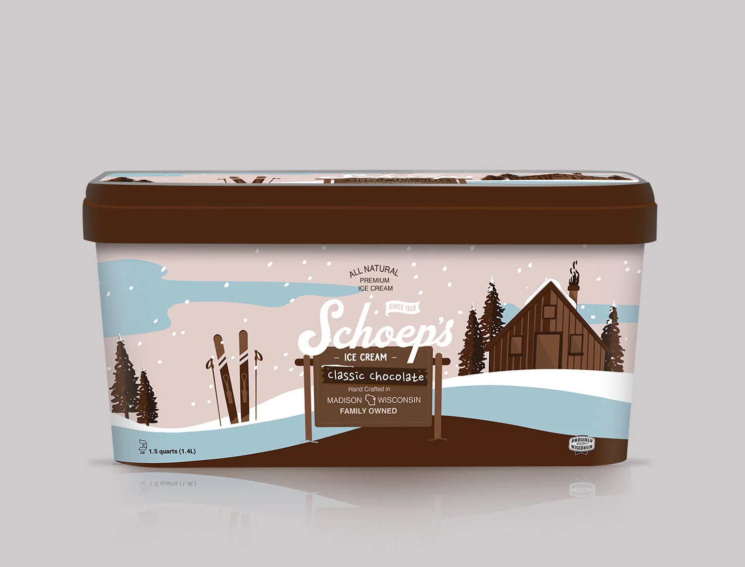
Package Design
Schoep’s Ice Cream came to me for a redesign package proposal.
Option1: For this design, I wanted to recreate their current look. I created modern swirls and drips, along with adding line work to imply sprinkles, chocolate sauce, and movement. This new design is playful and can easily be applied to all your flavors.
Option 2: For this design, I began by eliminating. I took things back to basics which allowed their logo and brand to become the focal point. This design keeps things local with hand-drawn icons of ice cream cones, cherries, camping, fishing, and of course the state of Wisconsin. This is a timeless and classic new look.
Option3: For the last design, I went out of the box a bit. I wanted to create a snapshot of Wisconsin. The logo, ice cream flavor, and text are all on a wooden camp sign. The illustration in the background leads you to your next adventure. Each flavor would have a new colorway along with a new illustrated Wisconsin snapshot. This design is vibrant and modern.